 Reeve Consult
The homepage, four ways
A thought experiment, designed phone first. Every word comes from the live site and every photo, device shot and logo is one we already own. Only the homepage is redesigned: menu links open today's live pages.
8 October 2026 · a prototype, nothing here is live or indexed
Direction 1
Ink
Dojo's structure in our colours. A dark hero with a huge headline, photos in tall capsules, a product shelf you can swipe through and reviews you can flick through.
Borrowed from: Dojo
Direction 2
Editorial
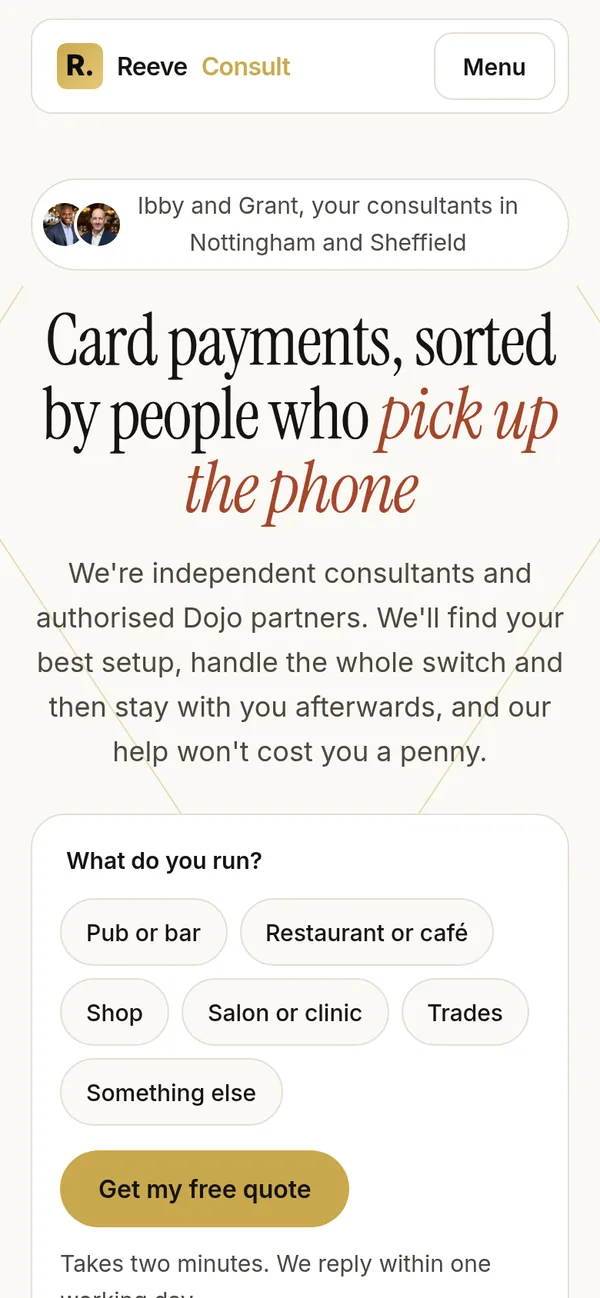
Light and warm, led by the serif. Your faces open the page, a picker asks what you run, and one set of tabs covers every service.
Borrowed from: Kleo
Direction 3
Bold
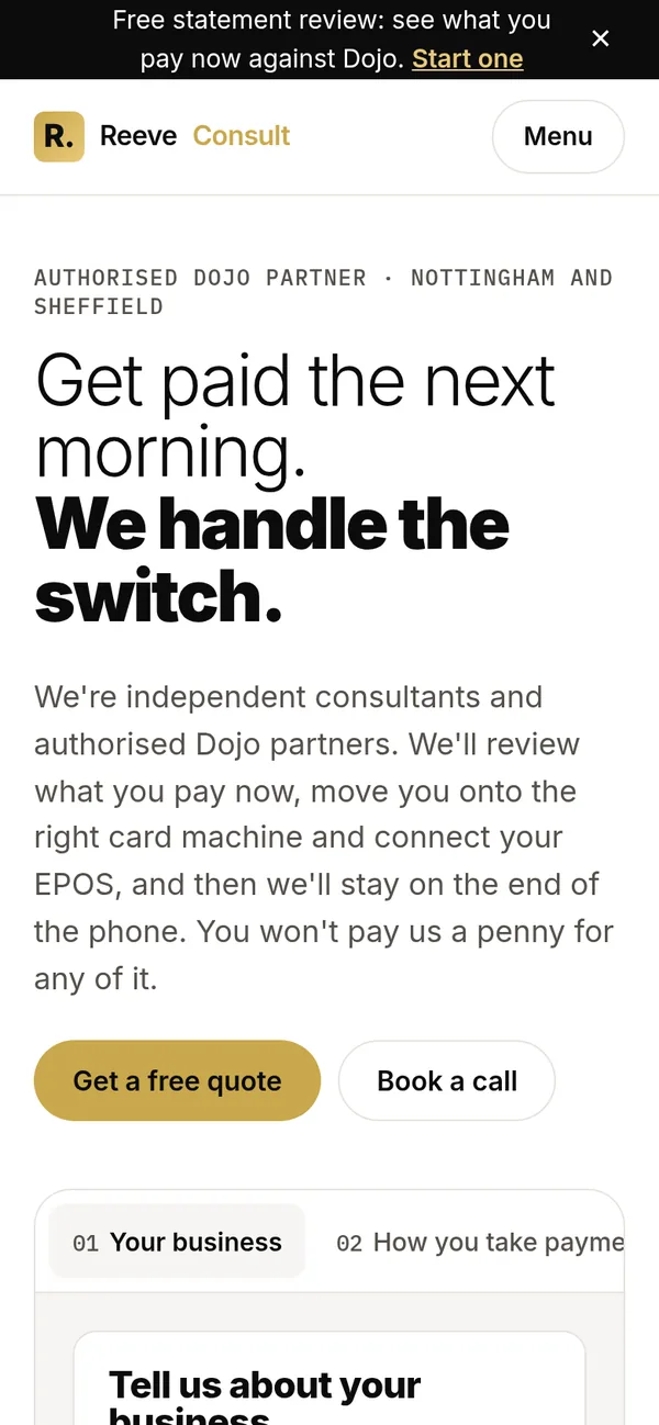
The Adapt Leads family look, with gold where Adapt has blue. The quote form sits in the hero and works step by step, then everything we do in one grid.
Borrowed from: our Adapt Leads site
Direction 4
Concierge
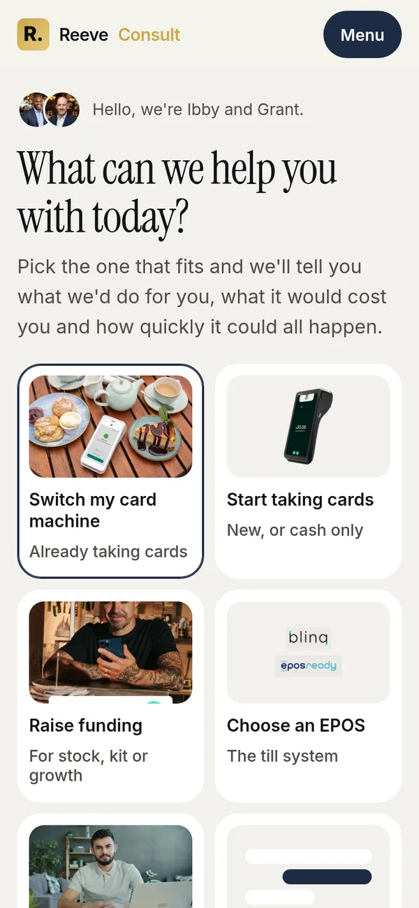
Built like an app. It asks what you need, then answers on the spot: what we'd do, what it costs you and how quickly. The shortest page of the four.
Borrowed from: phone apps
What changes in all four
- Phone first. Each page was designed at phone width first, then opened out for desktop.
- Payments lead. One message up top, with funding, EPOS, websites and AI one tap away, instead of a hero that rotates between three.
- Nothing moves on its own. No auto-rotating hero and no endless logo scroller. People swipe or tap when they want more.
- Only our own claims. Dojo's figures (140,000 businesses, 4.7 on Trustpilot, £46bn) and the 0.7% rate card are left off. Dojo facts that matter to a buyer stay, credited to Dojo.
- You two, up front. Real photos of you both and the six real client reviews, every one naming Ibby or Grant.
- The FCA line stays in every footer, word for word.
What about the teal?
Gold, black and stone stay, because the blog is built on exactly those and has no teal at all. Dropping teal brings the homepage into line with the blog.
But teal had one job: it's the colour that can sit as small text on a light background. Gold can't do that and stay readable. So whatever replaces it has to do that job:
Dojo's green and teal stay in their own device photos, which keeps the line clear between their brand and ours.